Case Study
UI/UX Case Study
From Chaos
to Clarity
A Desktop SaaS Platform Where Event Organizers Create, Manage and Analyze
Events All in One Place.
25 Days
Figma
UI/UX Designer
Internship at
Qviq
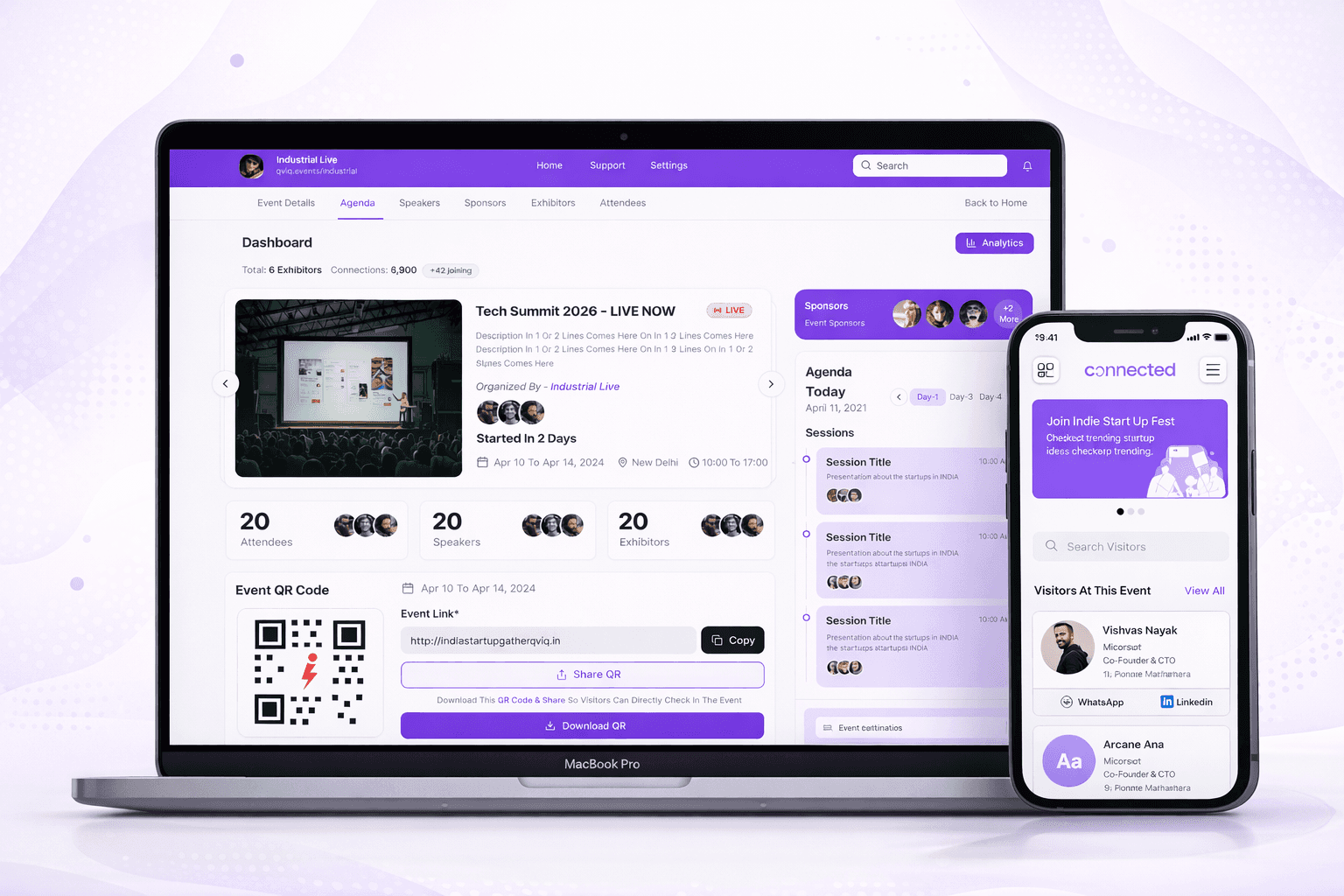
Event Dashboard
7,880
Attendees
<60s
Event Setup
Real-time
Analytics
Scroll
Setting the Scene
At Qviq, I designed a desktop SaaS platform that helps event organizers create, manage and analyze events all from one unified command center.
The platform connects directly with "Connected," our attendee networking app. Together, they form a complete ecosystem organizers plan and control on desktop, while attendees network and engage on mobile.
What the Platform Enables
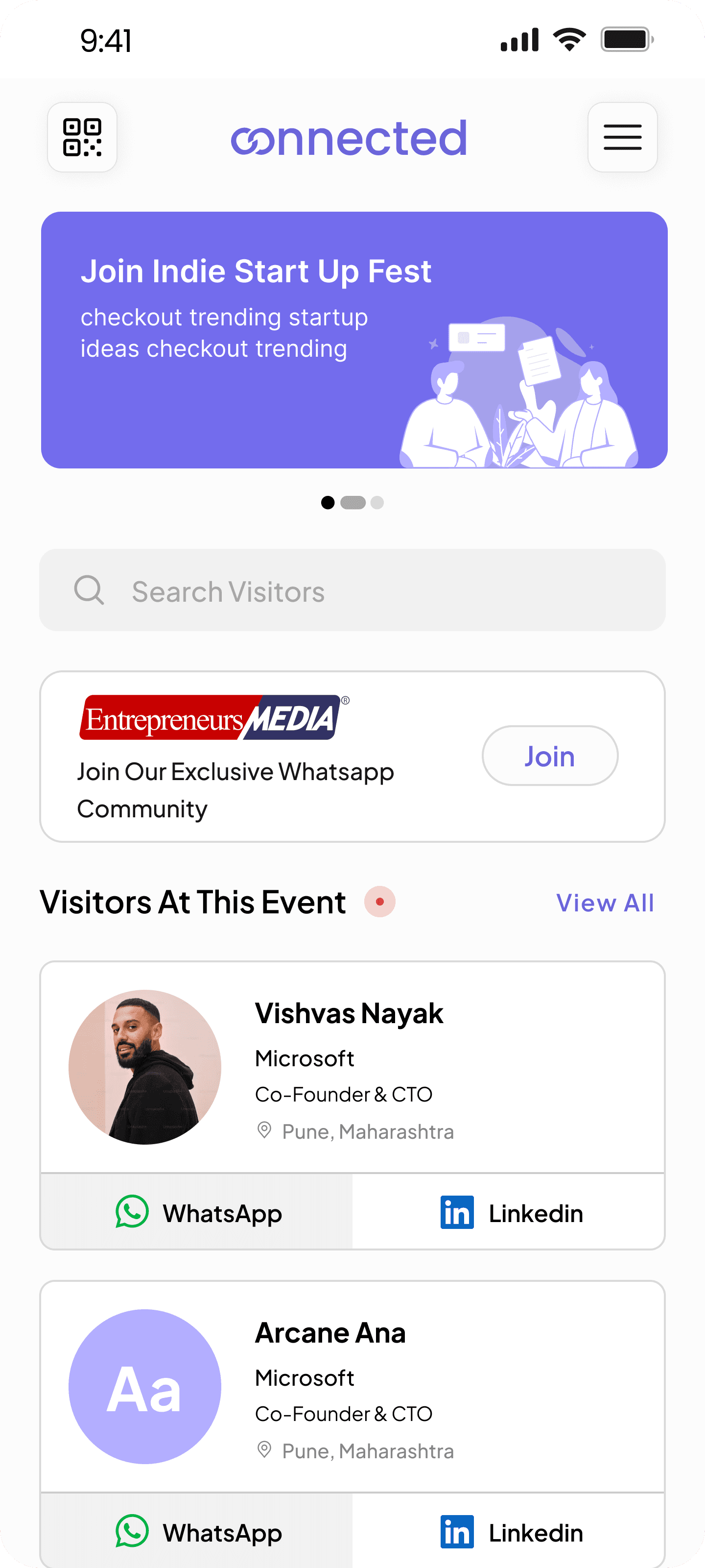
Quick Event Access
Home screen shows all events with clear
status visibility
AI-Powered Creation
Create complete events in under 60 seconds
using natural language
Real-Time Analytics
Monitor attendance, engagement, and
connections as events happen
Desktop Platform
Mobile App
The Problem
The People Behind It
Event organizers wear too many hats planner, coordinator, communicator, fixer.
Most of them rely on fragmented tools to manage everything. It's exhausting.
"I just want something where I can see what's happening, who's doing
what and what's pending all in one place."
Event Manager
User Research Interview
We knew we had to design not just a tool, but a calming experience something that simplifies, not adds to their stress.
WhatsApp Chaos
Urgent updates buried in group chats with no
organization
Endless Email Threads
Critical communication lost in chains nobody
wants to scroll through.
Messy Spreadsheets
Data scattered across multiple documents with
no single source of truth.
Design Vision
Create a platform that feels calm even when
events are chaotic
Every design decision was filtered through this principle from color choices to layout density
to interaction patterns.
Design Principles
Color System
Soft, calming palette
Layout Density
Breathable spacing
Interactions
Smooth transitions
Visual Hierarchy
Clear focus points
Calm Experience
Chaotic Events
Research & Empathy
Listening First
Before designing, I spent time understanding the real challenges organizers face daily.
💡 Key Takeaway
Organizers don't need "more features." They need
the right features, beautifully simplified.
What matters to them
Clarity, speed, control, collaboration
Competitor analysis
Eventbrite, Splash, Trello, Google Calendar
Who we're building for
Event planners, organizers, and their teams
What frustrates them
Jumping between tools, no visual timeline, poor team visibility
Why This Design Works in the Real World
Built for live events, real constraints, and human behavior.
Real-World Validation
Designed for Pressure, Not Perfection
Live events are chaotic. Organizers don't have time to explore interfaces or read manuals. This UI prioritizes clarity, hierarchy and immediate feedback over feature density.
Fewer Decisions, Faster Actions
Primary actions (share QR, view analytics, edit event) are placed directly next to relevant content. This reduces cognitive load and prevents decision fatigue during live moments.
Scales Without Extra Work
Whether an event has 50 or 5,000 attendees, the system behaves the same. Attendees and exhibitors onboard themselves eliminating manual setup and spreadsheet chaos.
AI That Assists, Not Overpowers
AI is used where it saves time (event creation, structure, setup) but
organizers remain in control. Nothing is locked, hidden or irreversible.
Information Architecture & Flow
Mapping It All Out
I started by creating simple user journeys and flow diagrams to capture what a day-in-
the-life of an organizer might look like with our platform.
Organizer Flow
Create an event
Set the schedule
Assign tasks
Track progress
Real-time updates
Team chat
Adjust timelines
Post-event overview
Feedback capture
Information architecture
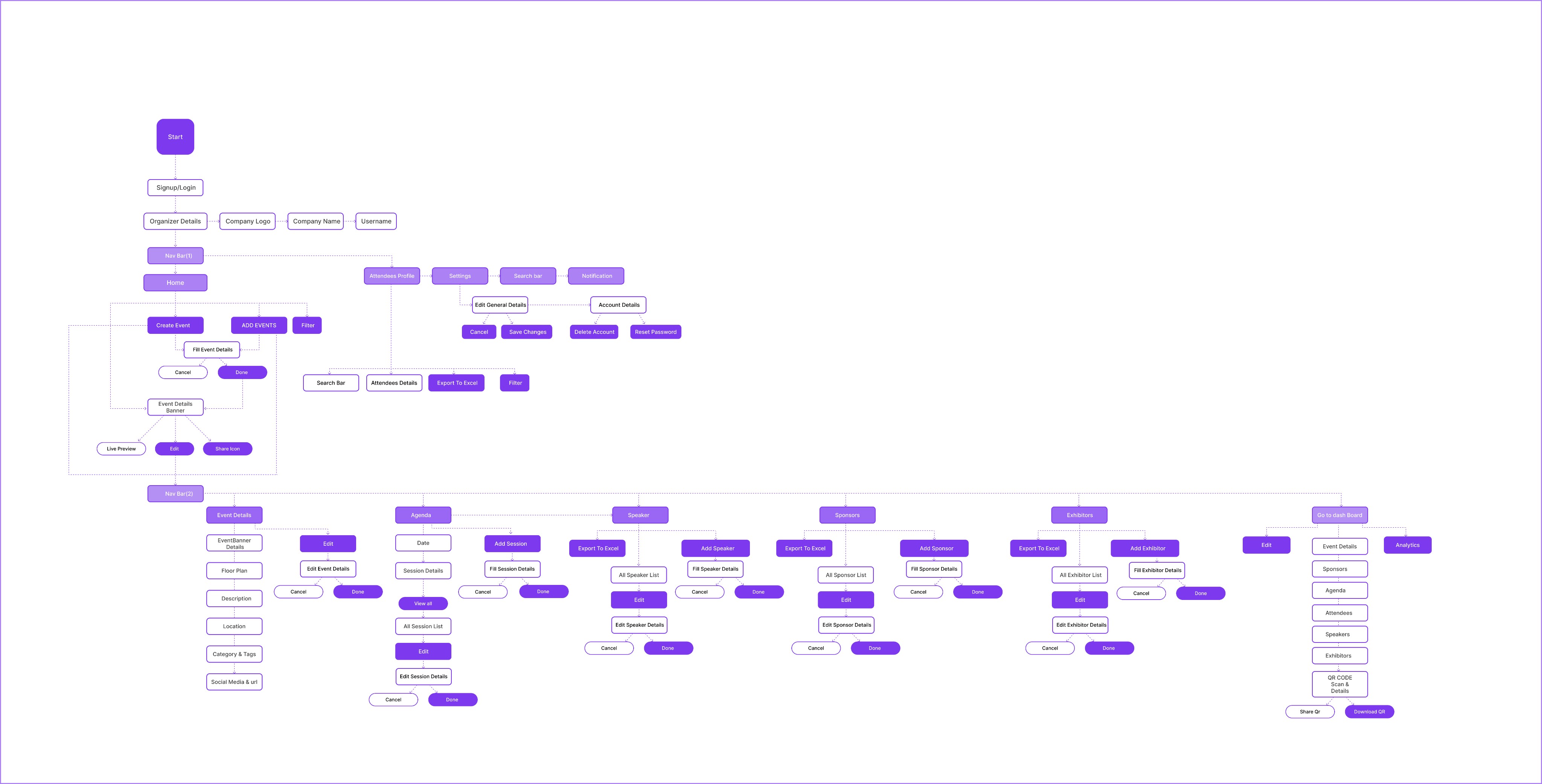
Information Architecture
Low Fidelity
Wireframes First
I sketched out early screens using basic wireframes in Figma. The goal: Strip away all
decoration and focus only on clarity and flow.
Easy Setup
Easily create your first event and manage
all the things
Card-style Dashboard
Visual layout that feels intuitive, not tabular
Real Time Analytics
Built-in communication without leaving the
platform
📸 Grayscale wireframes focusing on structure
Visual Design
Bringing It to Life
Once the structure felt solid, I moved on to building the UI with a soothing neutral
palette and accent blues for clarity and calm.
Color Palette
Purple-centric with neutral foundations. Color guides attention without overwhelming.
Primary
Primary Purple
#7C3AED
RGB: 124, 58, 237
CTAs, active states, links
Primary Light
#A78BFA
RGB: 167, 139, 250
Gradients, hover states
Primary Soft
#EDE9FE
RGB: 237, 233, 254
Backgrounds, badges
Neutrals
Dark
#1F2937
Gray
#6B7280
Light Gray
#E5E7EB
Background
#F9FAFB
White
#FFFFFF
Semantic
Success
#10B981
Enabled, active, positive
Warning
#F59E0B
Upcoming, attention
Error
#EF4444
Errors, negative trends
Clean, readable type scale. Optimized for quick scanning and information hierarchy.
Typography
Headings
Inter
Body Text
Inter - Clean & Readable
Page Title
24px • 600
Dashboard
Main page headers
Section Header
18px • 600
Key Metrics
Section titles
Card Title
16px • 600
India Startup Gather
Card headings
Body Text
14px • 400
Description in 1 or 2 lines comes here
Primary content
Label
14px • 500
Event Details
Tab labels, form labels
Caption
12px • 400
Apr 10 to Apr 14, 2024
Meta info, timestamps
Badge Text
12px • 500
Upcoming
Status badges, tags
Components & Icons
Components and Icons Used in Screens.
Primary Button
Main CTA with gradient purple
background
Analytics
Create with AI
Secondary Button
Outlined buttons for secondary
actions
Add Event
Edit
Status Badge
Visual indicators for event and item
states
Enabled
Upcoming
4 Days Event
KeyNote
Category Badge
Tags for categorization and filtering
Startup
Tech
Entrepreneurs
Business
Networking
Innovation
Marketing
Tab Navigation
Horizontal tabs with active indicator
Event Details
Agenda
Speakers
Sponsors
Day Selector
Multi-day navigation with arrows
Day-1
Day-2
Day-3
Stat Card
Metric display with label and icon
7,500
QR Scans
7,880
Attendees
Avatar Stack
Overlapping avatars for group
display
DK
PS
AP
+2
Icon Library
Lucide icons used consistently across the platform for clear visual communication.
Search
Notifications
Date
Time
Location
Attendees
Analytics
Add
Edit
Copy
Download
Share
Upload
Back
Filter
AI/Magic
QR
Code
Exhibitor
Speaker
Website
Previous
Next
High Fidelity
The Complete Platform
Every screen was designed with stressed organizers in mind visual hierarchy that
guides, actions that are always accessible and information that's never overwhelming.
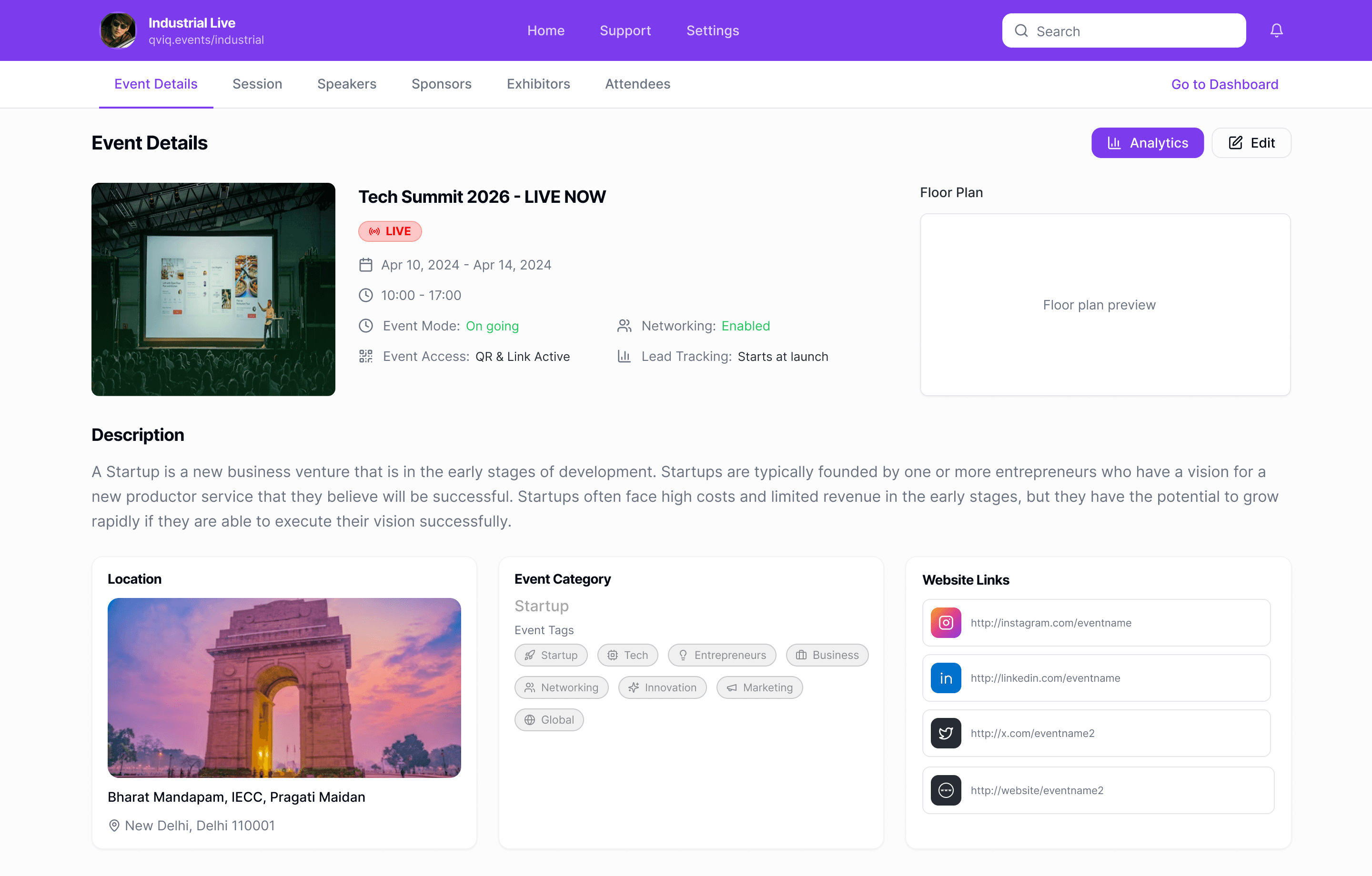
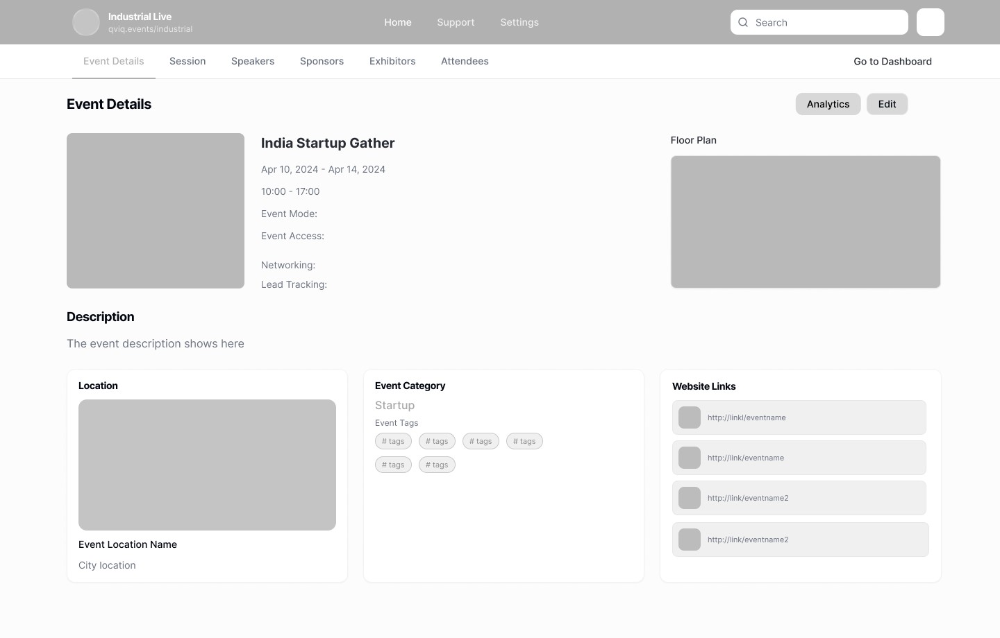
Event Details
Key info immediately visible with status indicators that reduce confusion and miscommunication.

Speaker Directory
Visual speaker cards with session counts for quick identification and management.
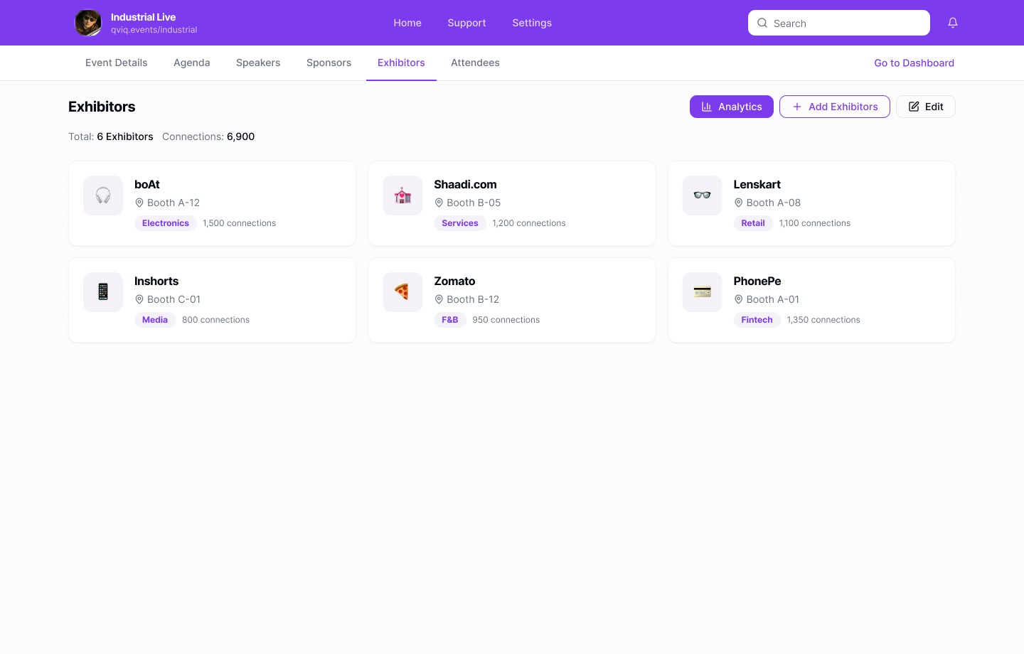
Exhibitors Hub
Exhibitor views focus on participation and engagement strength supporting business outcomes.
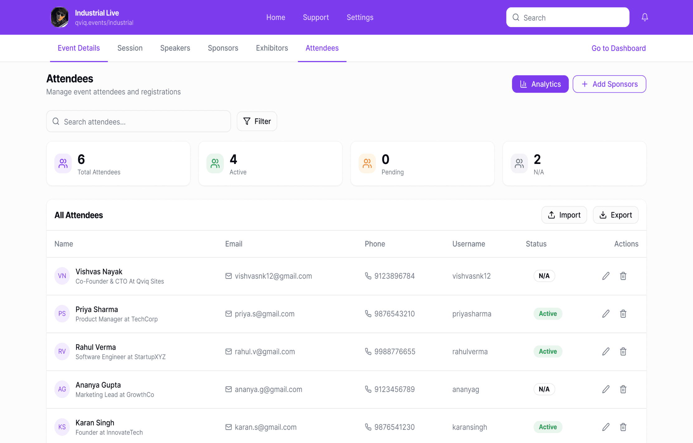
Attendees
View, search, and manage everyone registered for the event in one place.
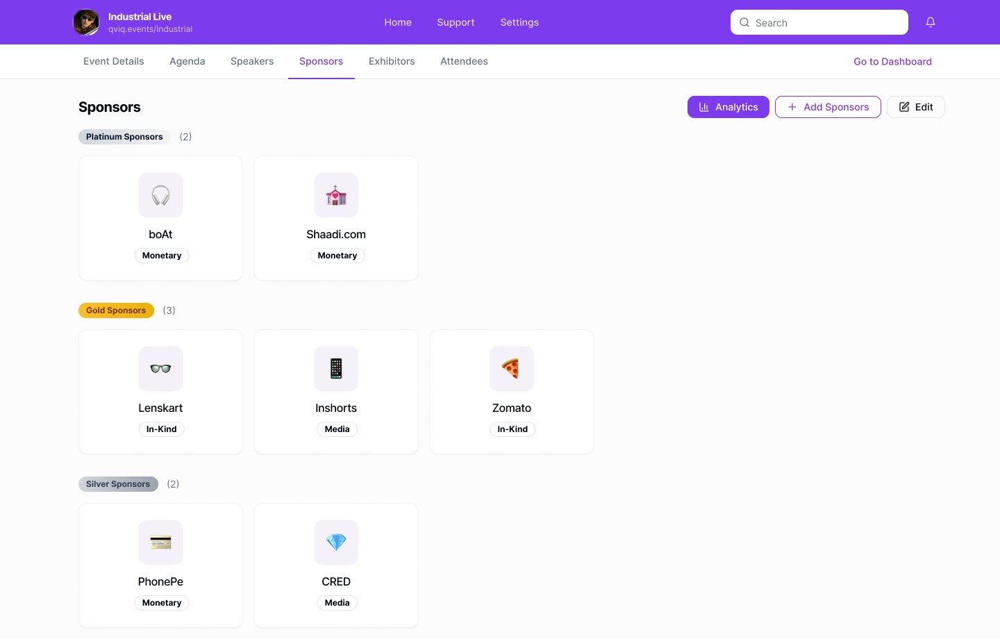
Sponsor Tiers
Hierarchical organization with platinum, gold, silver tiers for clear sponsor visibility.
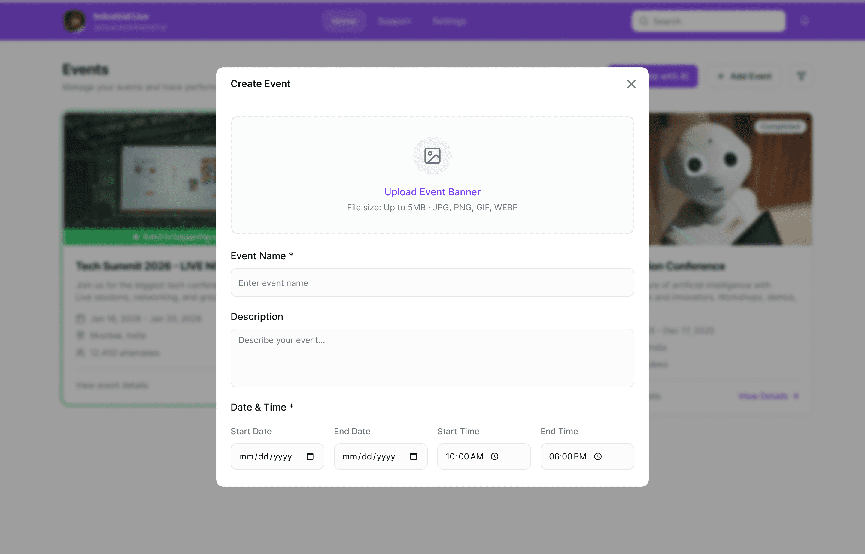
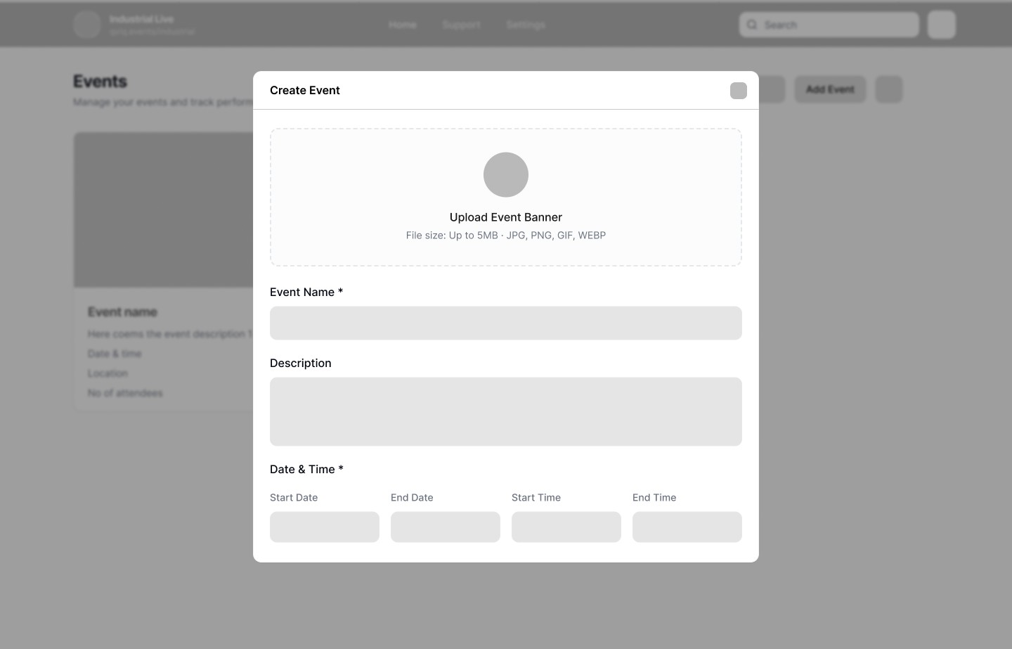
Create Event Form
Add essential event details without any extra steps.
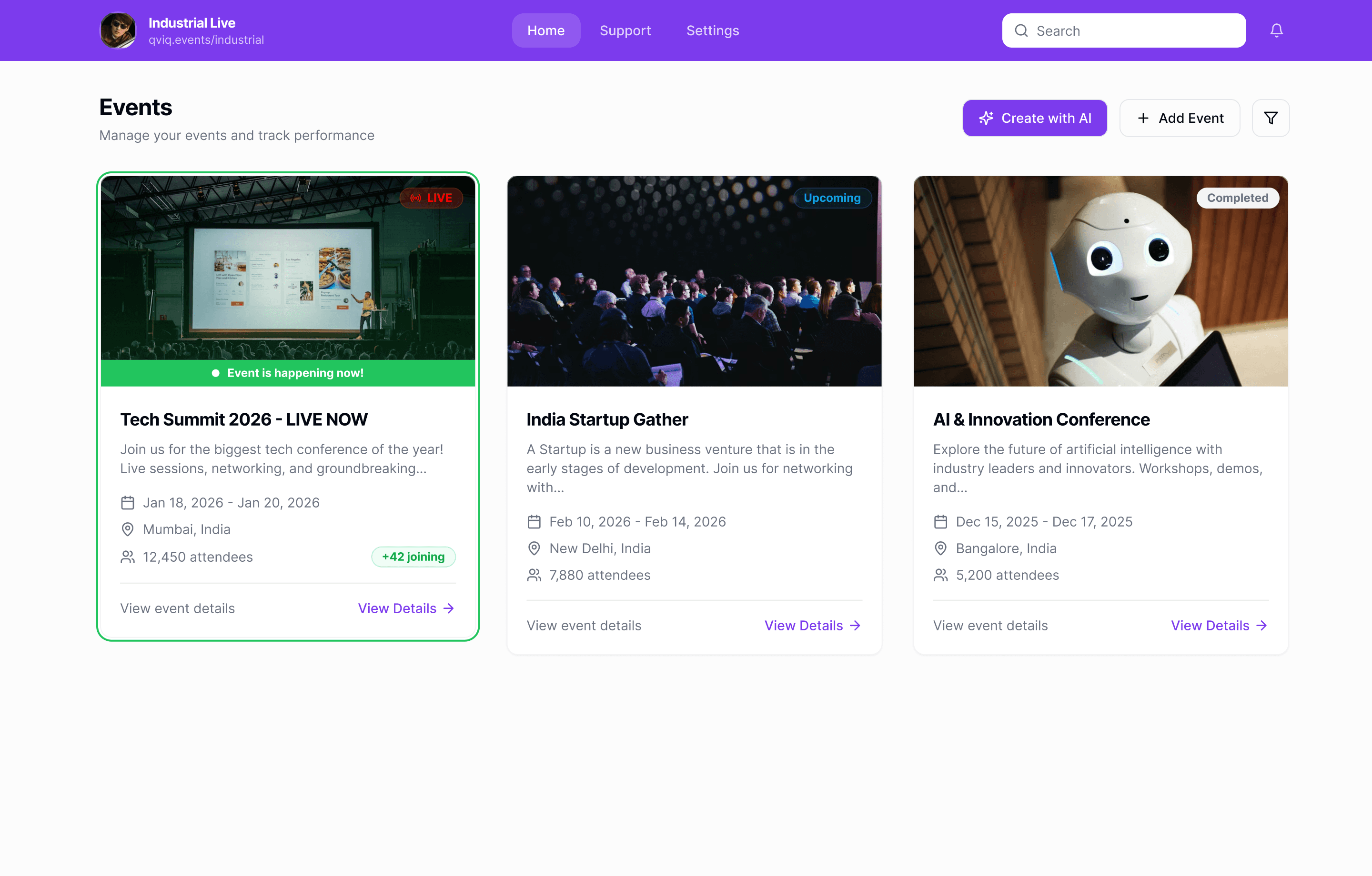
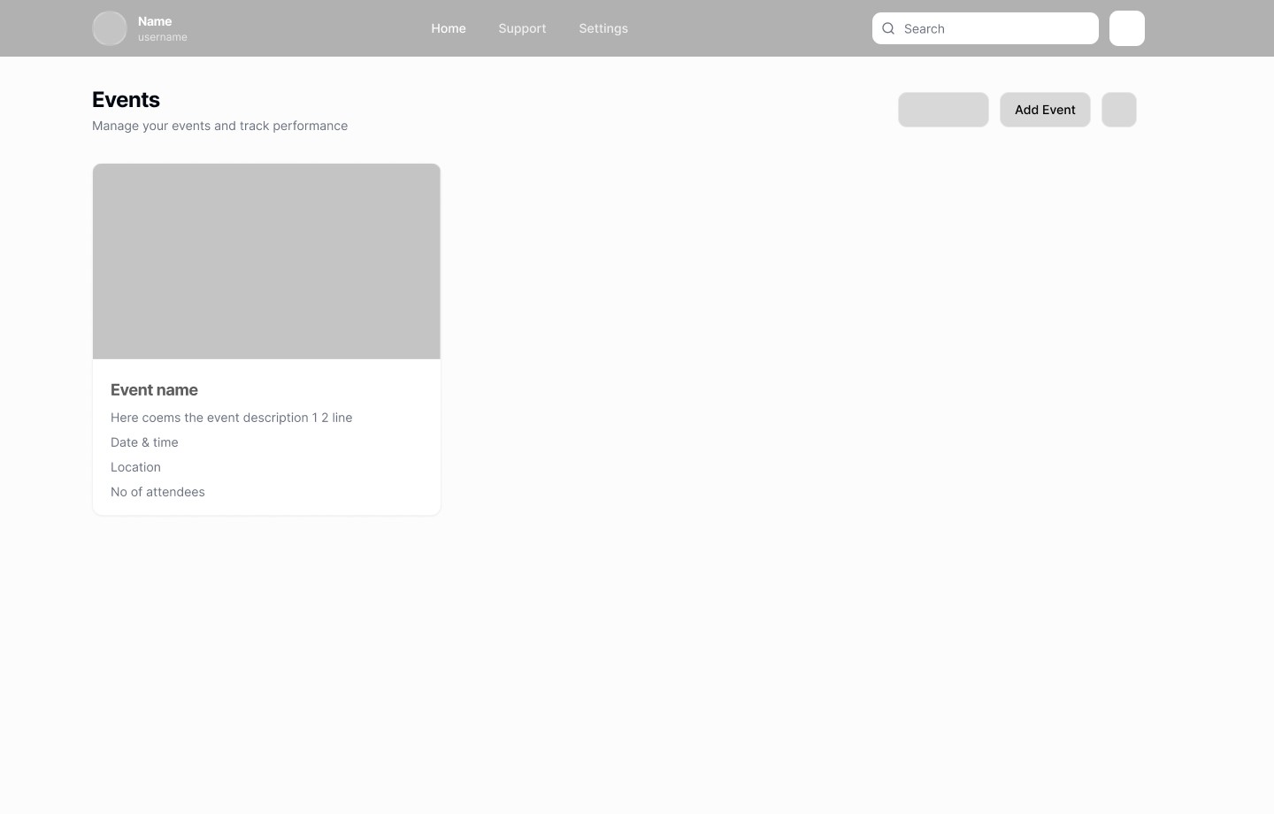
Events Home
Quick access to all events with clear status visibility and AI-powered creation CTA
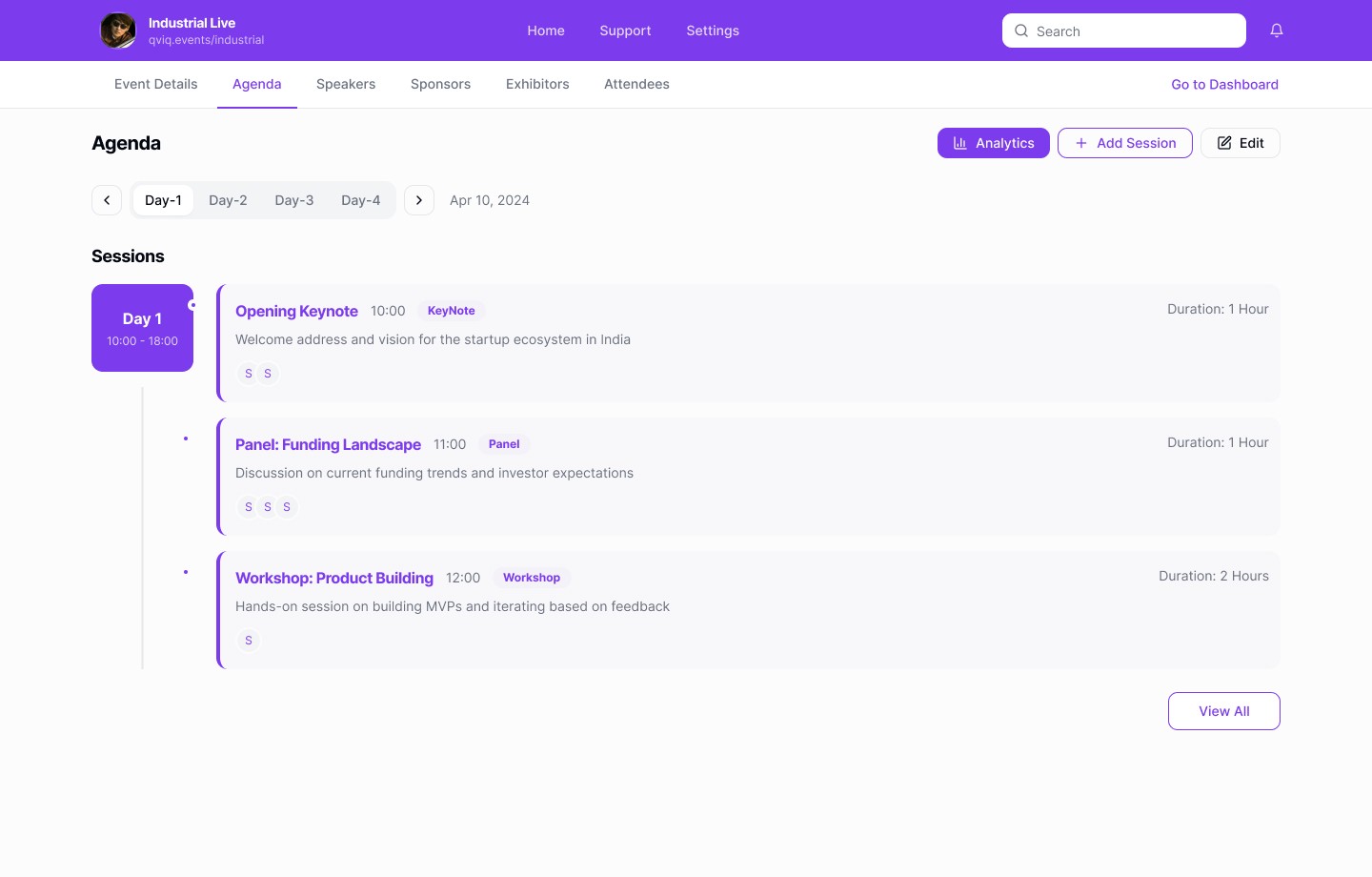
Agenda Manager
Timeline-based structure mirrors real-world planning easy to scan, edit and adjust during live events.
Deep Dive
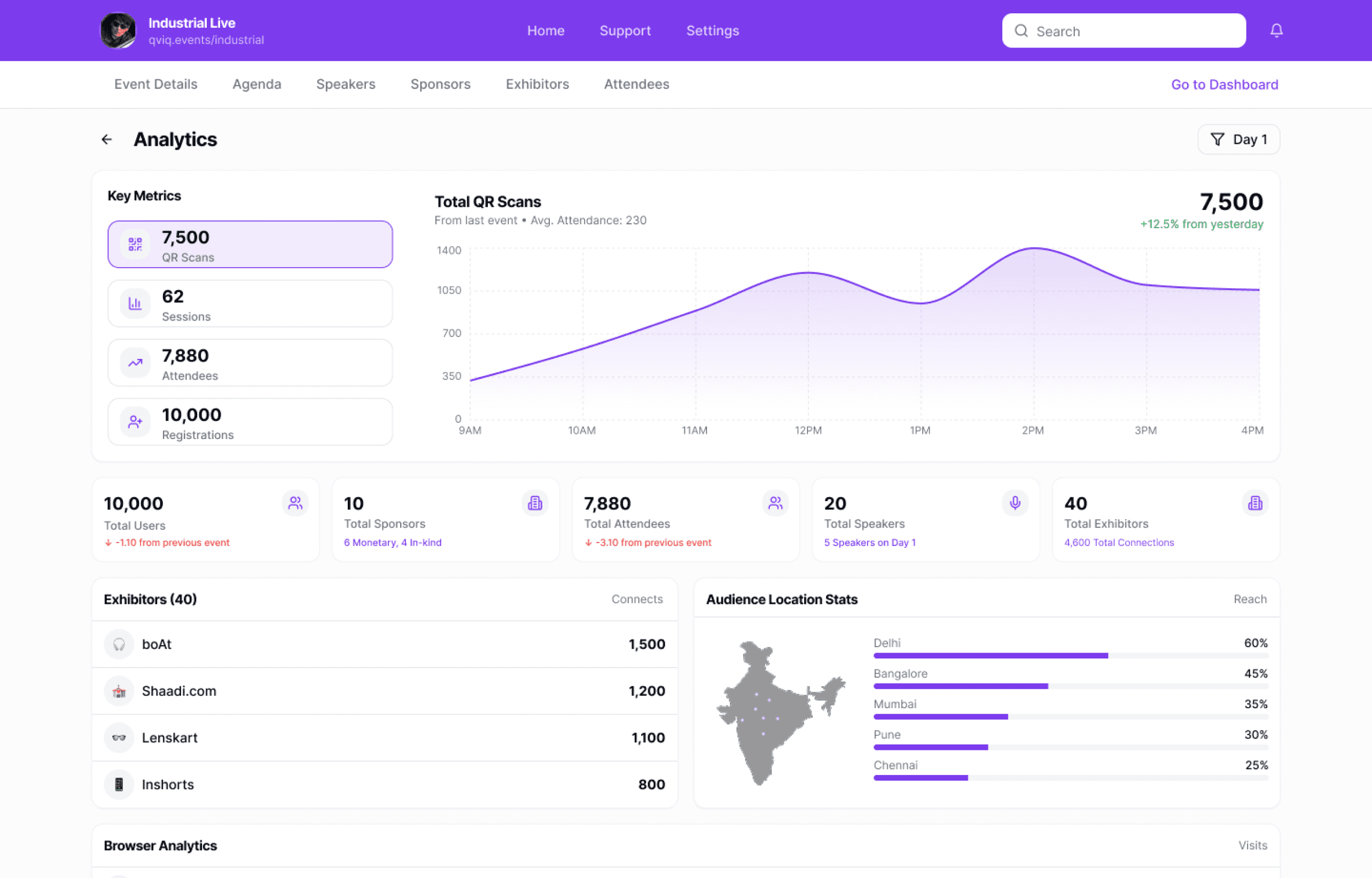
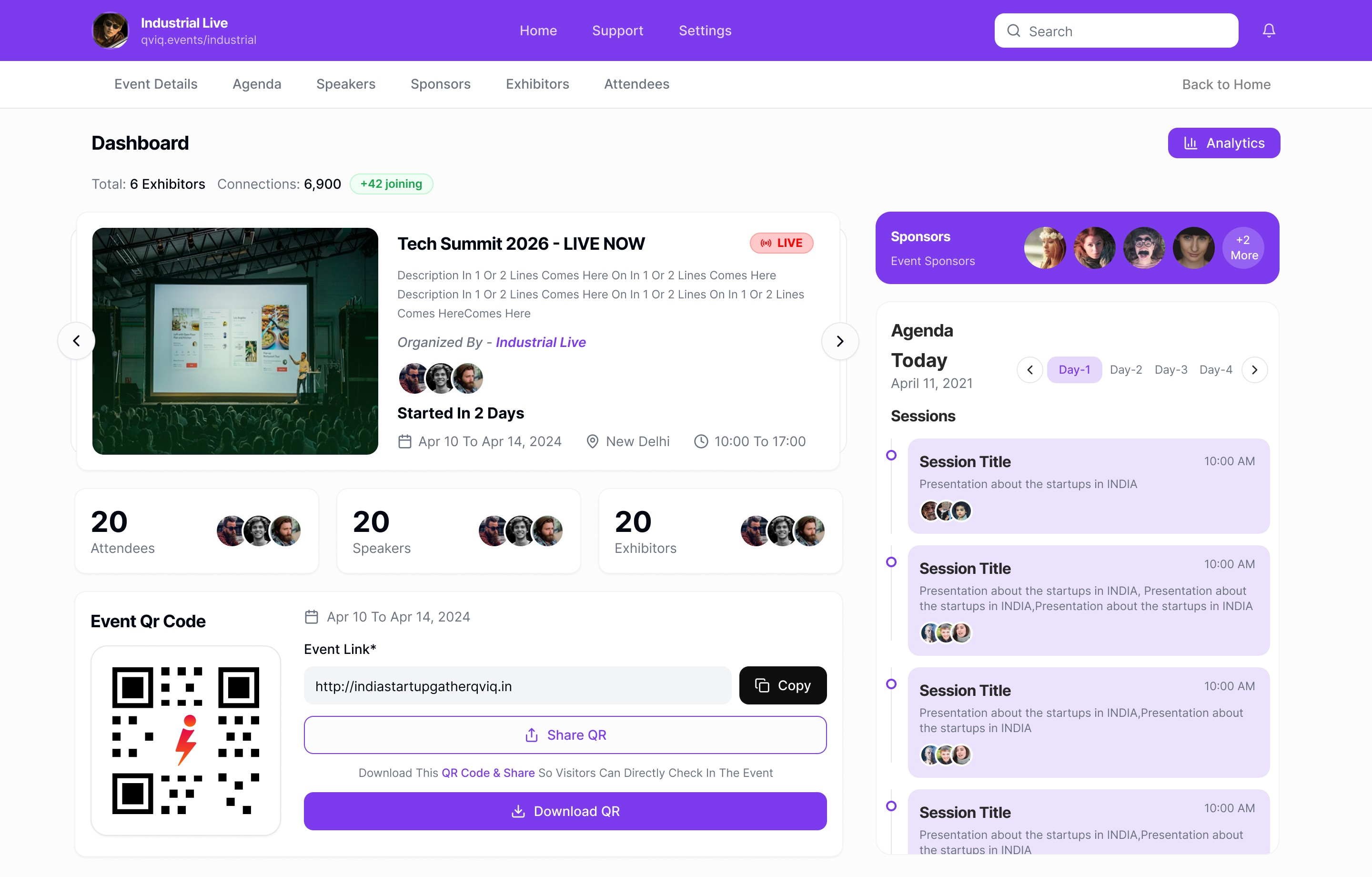
The Event Dashboard
The command center where organizers answer "how's my event doing?" in under 3
seconds. Designed for fast scanning during live events.
Design Decisions
Single Source of Truth
Event hero displays date, time, access status, and networking mode at aglance. Organizers never need to hunt for critical info.
QR Code Prominence
QR access is front and center organizers share event access constantly. One-click copy and download eliminates friction.
Live Session Timeline
The agenda sidebar shows what’s happening now and what’s next, eliminating uncertainty during live execution. This avoids reliance on external schedules or verbal coordination
Card-Based Information
Each module is self-contained in cards. Visual breathing room reduces cognitive load for stressed organizers managing multiple details.
UX Principles Applied
At-a-Glance Event Health
Key stats attendees, sessions, sponsors are immediately visible. No drilling down for basic questions.
Reduced Cognitive Load
Card separation and clear hierarchy let organizers scan quickly during high-pressure live events.
Action Proximity
Edit, share, and analytics buttons sit near the content they affect. No hunting through menus.
Deep Dive — Analytics
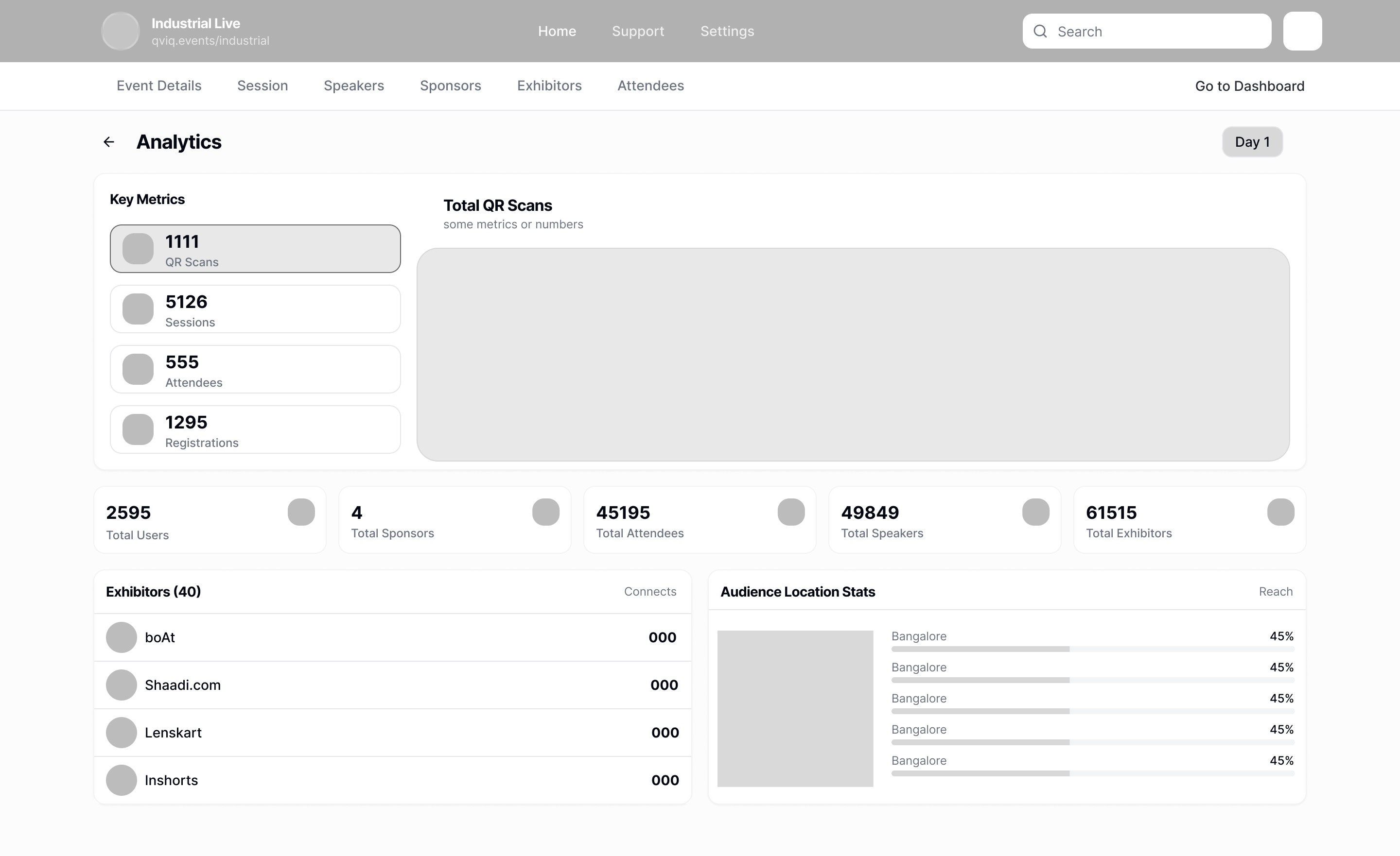
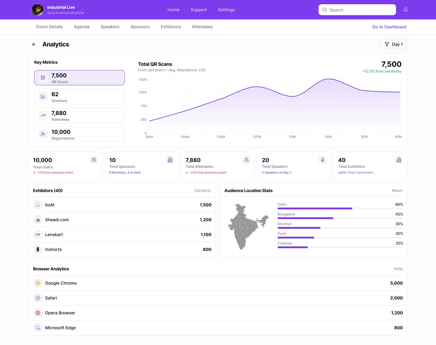
Real-Time Analytics
Attendance, engagement, connections, session performance all visible at a
glance. Designed to answer "how's my event doing?" without stress.
7,500
QR Scans
Engagement
62
Sessions
Tracked
7,880
Attendees
Connections
10,000
Registrations
Target
Design Decisions
Metrics for Decision-Making
Every number answers a real question: Are people showing up? Are
sessions working? Are connections happening? No vanity metrics.
Time-Series Visualization
Line charts show attendance patterns throughout the day. Peaks help
organizers identify popular sessions and allocate resources.
Geographic Distribution
Map visualization shows where attendees are coming from — critical for
sponsors evaluating regional presence.
Comparison with Previous Events
Bottom stats show change from last event. Organizers need relative
performance, not just absolute numbers.
Visual Design Principles
Replaces Manual Excel Tracking
Organizers used to export data and build charts manually. This dashboard provides real-time insights without the
spreadsheet work.
Simple Visuals for Stressful Moments
During live events, organizers are under pressure. Clean charts and large numbers are readable at a glance.
Data Density Without Overwhelm
Packed with information but never cluttered. White space and card separation prevent visual fatigue.
Why This Design Matters
"I check analytics 10+ times during an event day."Event Manager, User Interview. This drove our decision to make analytics information-dense yet instantly scannable no drilling down, no waiting.
Hero Feature
AI-Powered Event Creation
Describe your event in natural language or upload an existing document. AI
extracts key details and builds a complete, editable event in under a minute.
Create Event with AI
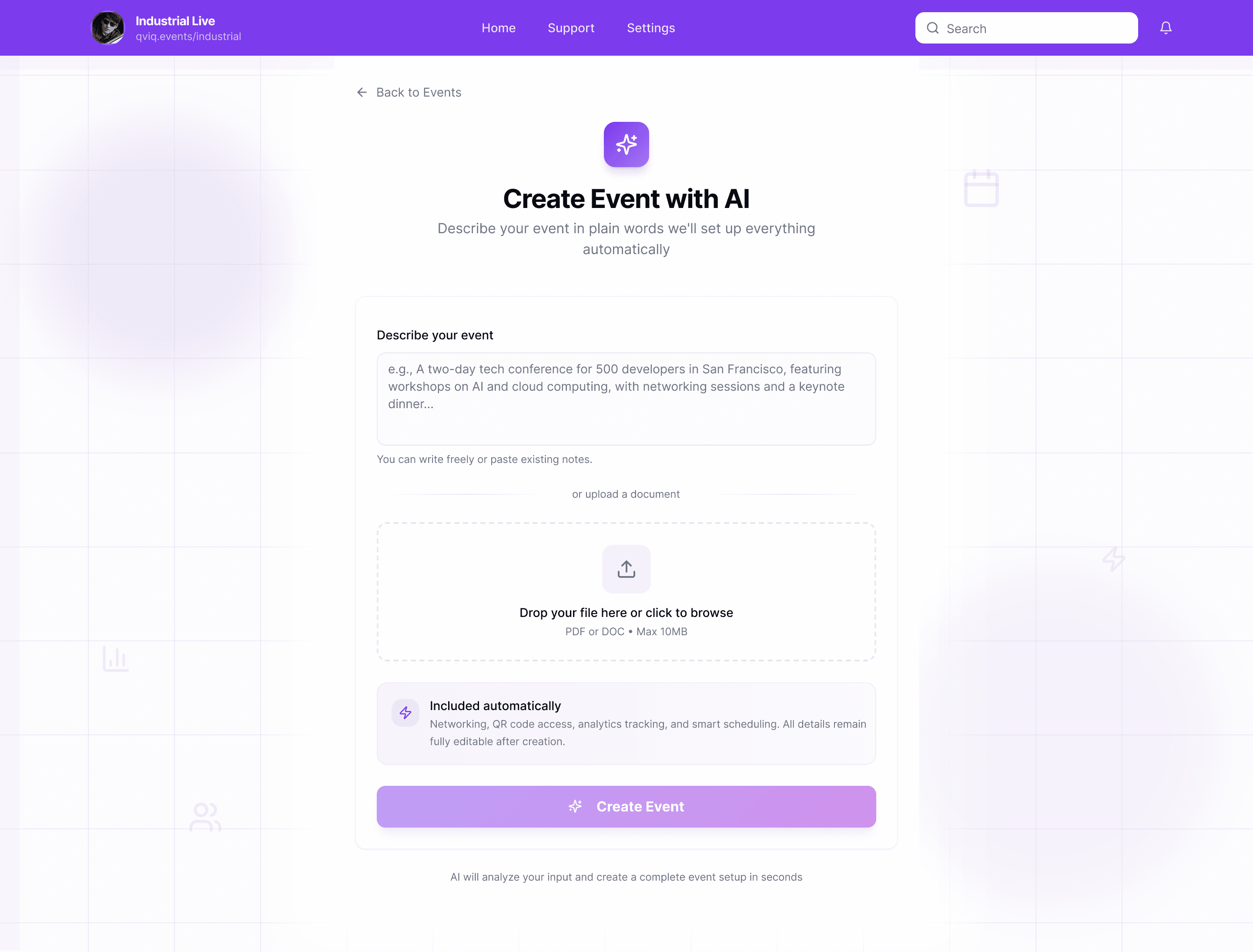
Natural Language
01
Describe or Upload
Type a natural language description or upload an existing PDF brief.

03
Review & Launch
Event is fully editable and ready to publish immediately.
Under 60 Seconds
No step-by-step forms or long questionnaires. Describe what you want, and the event is ready.
Complete Event Structure
AI generates event details, agenda, QR access codes, and analytics readiness automatically.
Confidence for First-Timers
New organizers get professional event structures without needing prior experience.
Future-Ready Design Thinking
This feature showcases how AI can augment human creativity, not replace it a key principle in
modern product design.
PDF Upload
The Bigger Picture
See it in action
Watch the full prototype walkthrough to see how all the pieces
come together.
Prototype Video
The Bigger Picture
Complete Event Ecosystem
Most event platforms stop at management. This platform goes further by creating a connected ecosystem between organizers and attendees.
Instead of manually adding exhibitor and attendee data often hundreds of entries the platform shifts the responsibility to the users themselves.
No Manual Data Entry
Self-Onboarding by Users
Real-Time Sync
Scales for 1000s
How It Works
Self-Service Data Collection
Organizer Platform
Desktop Dashboard
Creates and manages events
Generates QR code / link
Receives real-time data
No manual entry required for attendees and exhibitors
This Project
Auto-Synced
Event Created
Scan to Join
No spreadsheets.
No manual uploads.
No messy data.
Connected Platform
Mobile Networking App
Used by attendees & exhibitors
Sign in via QR or link
Enables networking
Auto-syncs to dashboard
Attendees
Exhibitors
The Result
For Organizers
Real-time, structured data directly in their dashboard
For Attendees
A seamless networking experience
For Exhibitors
Visibility and connections without extra effort
This ecosystem turns event management from a manual process into an automated, self-updating system saving time, reducing errors, and scaling effortlessly.
These moments of genuine user emotion were the highlight of the project.
Conference Organizer
"I love that I don't have to manage
attendee data manually anymore.
People just show up in the system."
External Event Manager
"This feels calm, even when the
event isn't. That alone makes it
better than what we used before."
"For the first time, I didn't feel
lost during a live event.
Everything I needed was just…
there."
Internal Ops Team, Qviq
"The dashboard answers my main
question instantly: what's
happening right now and what's
next."
External Event Organizer
"Sharing the QR code on the spot
saved us so much back-and-forth
with attendees."
Event Coordinator
We shared the clickable Figma prototype with 5 testers
1 internal team members at Qviq, and 4 external event
organizers or members.
Real Feedback, Real Emotions
The Bigger Picture
Designing Under Pressure
Live events don't pause for bugs. I learned to
prioritize clarity and resilience over polish building interfaces that remain calm when organizers can't be.
Calm Is a Design Outcome
The biggest success wasn’t adding power features, but reducing stress through hierarchy, defaults and automation where it truly mattered.
Systems Over Screens
I learned that good UX here wasn’t a single feature it was how dashboards, analytics, networking and AI worked together as one ecosystem.
Reflection
What I Learned
Building for real operational pressure taught me to design with restraint, think
systemically, and trust users with the right level of control.
it's about understanding people
under pressure.
This project reinforced why I love solving real problems through design. I'm
always looking to work on products that make complex work feel simple.
Always learning. Always building. Always improving.
Good design isn't about pixels